Public Art Proposal Display
Bayview Icons
Kirk Crippens
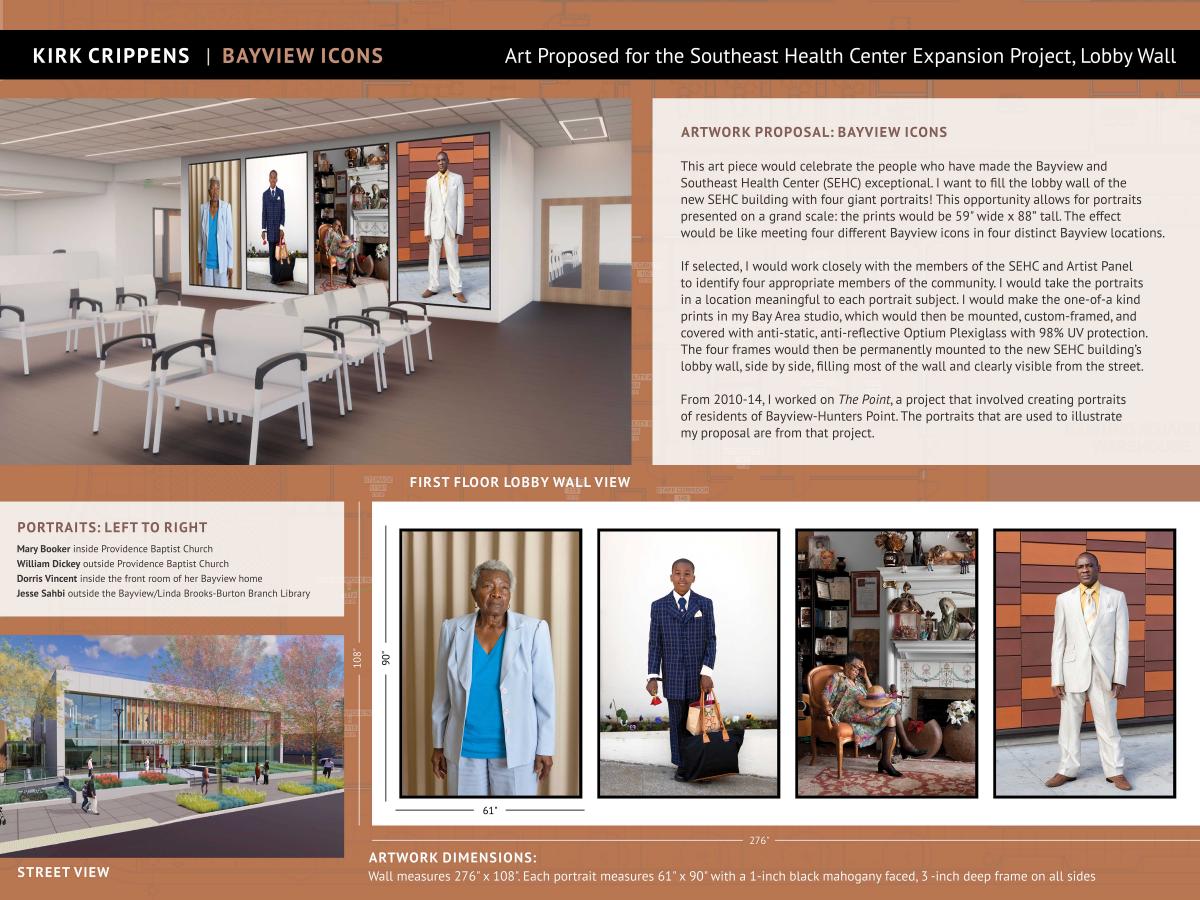 This art piece would celebrate the people who have made the Bayview and Southeast Health Center (SEHC) exceptional. I want to fill the lobby wall of the new SEHC building with four giant portraits! This opportunity allows for portraits presented on a grand scale: the prints would be 59” wide x 88” tall. The effect would be like meeting four different Bayview icons in four distinct Bayview locations.
If selected, I would work closely with the members of the SEHC and Artist Panel to identify four appropriate members of the community. I would take the portraits in a location meaningful to each portrait subject. I would make the one-of-a kind prints in my Bay Area studio, which would then be mounted, custom-framed, and covered with anti-static, anti-reflective Optium Plexiglass with 98% UV protection. The four frames would then be permanently mounted to the new SEHC building's lobby wall, side by side, filling most of the wall and clearly visible from the street.
From 2010-14 I worked on The Point, a project that involved creating portraits of residents of Bayview-Hunters Point. The portraits that are used to illustrate my proposal are from that project.
There are no special maintenance requirements, beyond that of any framed artwork. I plan to work with Smith Andersen North of San Anselmo, a highly experienced photography framer to mount the prints and build the custom frames. I included their estimate with my submission.
View a larger image of the proposal.
A Healthy and Caring Community
Frederick Hayes
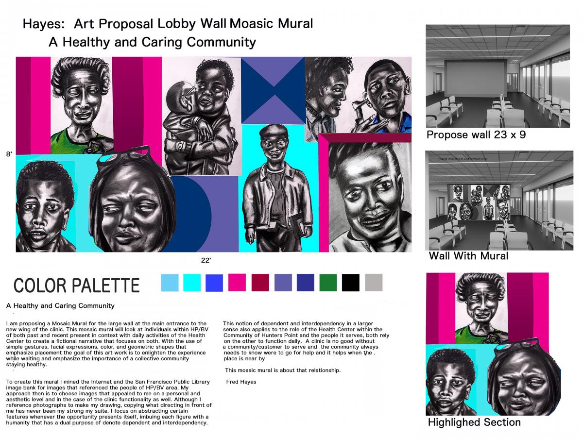 I am proposing a Mosaic Mural for the large wall at the main entrance to the new wing of the clinic. This mosaic will look at individuals within BV/HP of both past and present in context with daily activities of the Health Center to create a fictional narrative that focuses on both. With the use of simple gestures, facial expressions, color and geometric shapes that emphasize, the goal of this art work enlighten the experience while waiting and emphasize the importance of a collective community staying healthy.
To create this mural I mined the internet and the San Francisco Public Library image bank for images that referenced the people of HP/BV area. My approach then is to choose images that appealed to me on a personal and aesthetic level and in the case of the clinic functionality as well. Although I reference photographs to make my drawing, copying what’s directly in front of me has never been my strongest suite. I focus on abstracting certain features whenever the opportunity presents itself, imbuing each figure with a humanity that has a dual purpose to denote dependent and interdependency.
The notion of dependent and interdependency in a larger sense also applies to the role of the Health Center within the Community of Hunters Point and the people it serves, both rely on the other to function daily. A clinic is not good without a community/customer to serve and the community always needs to know where to go for help and it helps when the place is nearby.
Starting from the top left hand corner of the mural I made a drawing of a older woman who has her eyes closed while the doctor not seen is checking her heartbeat, but you can see his hand if you look close. She is also placed between two columns or bands of color that could be a window and she is looking out and into the neighborhood a guardian angel or protector? The next image is a huge or embrace and here I believe what fascinate me was folds in the clothing and direction of arms show a complexity that is parallel with BV/HP, but the facial expression makes a unique counterbalance which unifies the drawing. The next image of a young man getting his ear examine is sort of a repeat of the first one in that he too is participating in activities at the clinic. He actually started out much younger in the original photograph, but looking at him now I feel that he is older.
The bottom left image of the young man is a composite of Ruben Youngblood, he along with Wardell Coleman were killed when a dirt wall collapsed on them while they were playing at a housing constructions site. Placing him next to the woman with the glass on her head who looks sort of side eye toward him creates a completely different dynamic. In her case though the image is based on her reaction to the Pacific Gas and Electric Co power plant closing in 2006. Emissions from the plant included nitrogen oxide, carbon monoxide and other chemicals that cause health problems. I remember walking by plant late at night when I had an art studio at the shipyard the fumes that came out were very unique to say the least. The last two drawings are based on an image from the San Francisco Public Library image bank "Shades of Bayview section and my personal inventory of drawings of African American respectively. For me he is a under recognize and underappreciated leader and her smile reflects a familiarity that any one of us could know or have. That familiarity of community, family and health is what give weight to this project.
This proposal was inspired by the history and community of the Southeast Health Center and Hunters Point/Bayview neighborhoods recognizing that both work hand in hand to keep each other safe and strong.
View a larger image of the proposal.
Woven Calmness
Ramekon O’Arwisters
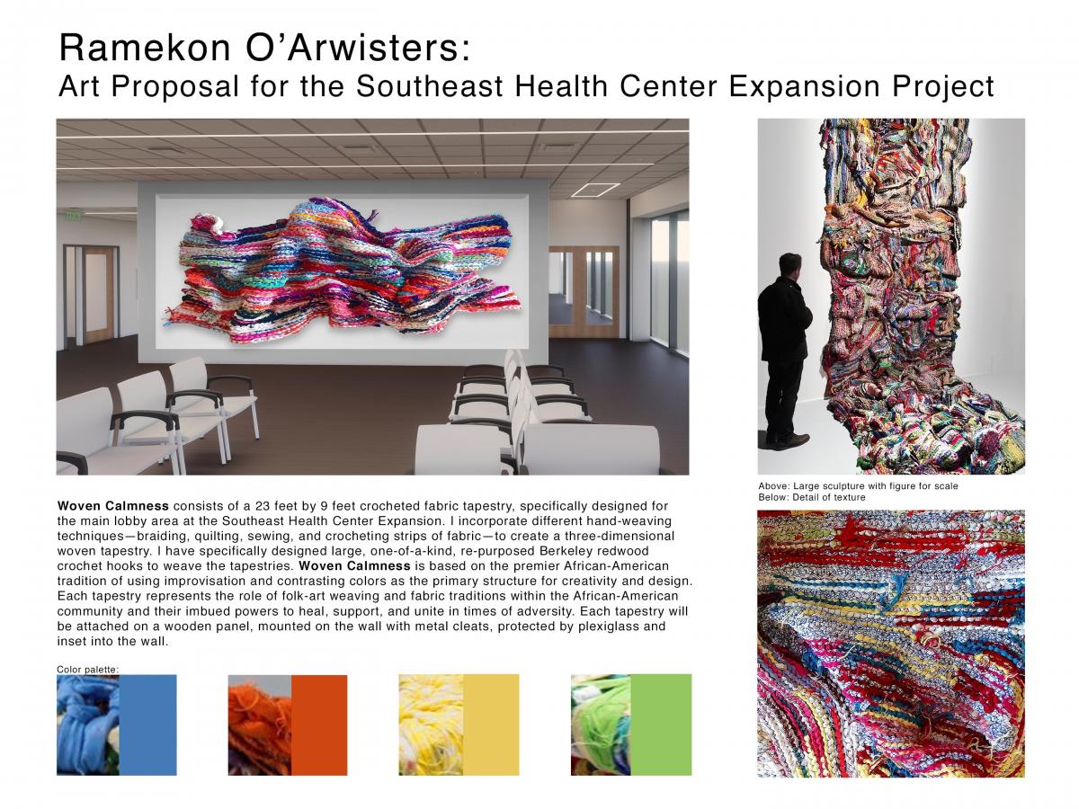 Woven Calmness consists of a 23 feet by 9 feet crocheted fabric tapestry, specifically designed for the main lobby area at the Southeast Health Center Expansion. I incorporate different hand-weaving techniques—braiding, quilting, sewing, and crocheting strips of fabric—to create a three-dimensional woven tapestry. I have specifically designed large, one-of-a-kind, re-purposed Berkeley redwood crochet hooks to weave the tapestries. Woven Calmness is based on the premier African-American tradition of using improvisation and contrasting colors as the primary structure for creativity and design. The tapestry represents the role of folk-art weaving and fabric traditions within the African-American community and their imbued powers to heal, support, and unite in times of adversity. The tapestry will be attached on a wooden panel, mounted on the wall with metal cleats, protected by plexiglass and inset into the wall.
View a larger image of the proposal.
Nature in the Bayview
Bob Armstrong
 The two glass partitions for the two waiting rooms of the SEHC are the focus of my project.
The designs for these partitions are meant as a tribute to the diversity of the ecology of the Bayview district. They are meant to be relaxing and meditative for the visitors. They are intended as an invitational visual bridge between the natural world outside the Southeast Health Center and the rooms where the community members will wait for medical care. They will also serve as a semi-opaque divider between staff and community, so both groups will see and enjoy the connection to nature.
I chose the India Basin Shoreline Park and the Quesada Gardens as the inspirations for my imagery. India Basin is a park near the Hunters Point Shipyard where I have an art studio. Community members fish, swim, boat, and enjoy this park along the shoreline. The Quesada Gardens are near the house where I used to live, and are a beautiful community garden with a wonderful variety of plants and trees. They are a focal point of beauty and engagement for that part of the 3rd Street neighborhood.
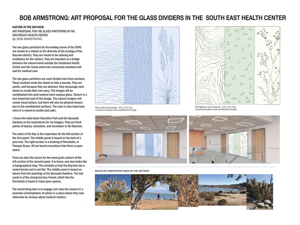
The two glass partitions are each divided into three sections. These separate but connected sections, all with different imagery, invite the viewer to take a journey. The viewer will look back and forth between them, and form associations that are based on their personal experiences. Other than the carefully drawn Fennel and the Horsetails, the ideas for the sections are not explicitly defined. While derived from nature, sometimes literally, they are only meant to be suggestions. They are poetic, and because they are abstract they engage and encourage each viewer to create their own story.
The water of the Bay is the inspiration for the left section of the first panel. That section celebrates water, because the Bayview is bounded by water, and it helps define the neighborhood. The middle panel is based on the bark of a pine tree. Pine trees are found everywhere around the Bayview; there is one right by the south entrance to my studio. These trees clean the air and help us to relax in the midst of concrete and traffic. The right section is a drawing of Horsetails, or Pampas Grass. These plants are large and showy, and are found everywhere that there is open space. They wave and shimmy in the wind, flying the flag for beauty.
The many and varied trees of the Bayview are also the source for the woodgrain pattern of the left section of the second panel. This image looks inside the heart of a tree, not just at the exterior. Because it is linear, it also looks like a topographical map, and reminds us that the Bayview is not flat, but has lots of hills and different terrains. The middle panel is based on leaves from the plantings at the Quesada Gardens. When the wind becomes brisk, the leaves are swept around and form lovely patterns in the air and on the sidewalks. The last panel is of Fennel, which like the Horsetails is found in many open spaces. They are lacy and delicate, and have an airy presence. They are strong, however, and can survive anywhere they get a little water and encouragement.
The windows will be made of 3/8 in. tempered glass appropriate for public spaces. The overall size of each window divider is 8 ft. wide by 7 ft. 2 in. tall. The three sections within them will each be about 2 ft. 8 in. wide by 7 ft. 2 in. tall. There will be no metal dividers between these sections, since that would interrupt the visual flow, and the glass is strong enough not to need dividers. One side of the glass will be white acid-washed and semi-opaque, except for the sandblasted surfaces with imagery, which will be darker and opaque. The white-washed surface will provide privacy to the workers in the offices. Color will not be used for the project, and this will emphasize the design. Because there is no added color, the images will not fade. This will also allow lots of pure light to flow back and forth between waiting rooms and staff office spaces, for maximum health and illumination. Maintenance for the glass will be very simple, requiring only periodic cleaning with normal glass cleaner.
The designs I have drawn by hand will be sandblasted into the glass by a professional glass fabricator, whom I will work closely with. (Her contact information is below.) The sandblasted designs will be a slightly darker shade than the majority of the glass, and will be at once subtle and striking. The center panel will also be reversed, so that the carved surface will be on the surface away from the waiting room. This will shift the light and the perception of design slightly, and will provide visual variation. Texture is a very important part of these pieces. The natural imagery will create visual texture, but there will also be physical texture due to the sandblasted surfaces. It will draw the viewers in on both sides of the glass and engage them in the peaceful contemplation of nature.
View a larger image of the proposal.
Untitled
Ron Saunders
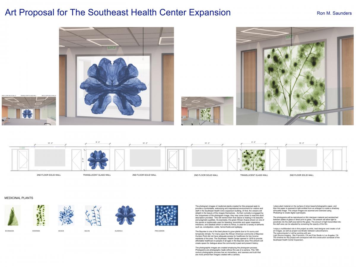 The photogram images of medicinal plants created for this proposal seek to provide a comfortable, welcoming and inspirational environment for visitors and staff in the Southeast Health Clinic expansion building. At first, the viewers will delight in the beauty of the images themselves. As their curiosity is engaged by the uniqueness of the photogram image, they may come closer to read the short description provided. This will remind them that nature is healing in its beautiful and pragmatic qualities. As examples, the green African Acacia shown on one of the panels is traditionally used for bleeding, bronchitis and upper respiratory infections, and Gladiola which is native to Africa, is used for a variety of ailments such as, constipation, colds, hemorrhoids and epilepsy.
The Bayview is one of the best places to grow plants due to it’s sunny and temperate climate. For many years the African American community of Bayview Hunters Point did not have adequate access for healthcare for low income residents of the area. The Southeast Health Center opened in 1979 to provide affordable healthcare to people of all ages in the Bayview area.This artwork will create space for dialogue about the community’s past and present history.
The photographic images are created employing the photogram process. Photograms are photographs made without the use of a camera. This 19th century photographic process has an immediacy, and rawness and truth that are more primal than images created with a camera.
I place plant material on the surface of silver-based photographic paper, and then the paper is exposed to light emitted from an enlarger to create a shadowy silhouette image. The unique images are scanned and colorized using Photoshop to create digital cyanotypes.
The photograms will be reproduced on film interlayer material and sandwiched between plates of glass or direct print to glass. The artwork will allow light to penetrate into the staff area behind the glass. The amount of light transmitted into the staff area can be adjusted by screening the opacity of the film.
View a larger image of the proposal.
For more information,
Please contact: trisha.lagasogoldberg@sfgov.org or (415) 252-2222.
Materiales traducidos están disponibles para usted de manera gratuita. Para asistencia, notifique a trisha.lagasogoldberg@sfgov.org or (415) 252-2222.
我們將為閣下提供免費的書面翻譯資料。 如需協助, trisha.lagasogoldberg@sfgov.org or (415) 252-2222.
Ang mga materyales na nakasalin sa ibang wika at ang mga serbisyong tagapagsalin sa wika ay walang bayad. Para sa tulong, maaring i-contact si trisha.lagasogoldberg@sfgov.org or (415) 252-2222.


Opportunity For Public Comment
The Final Selection Panel meeting will take place Friday, November 16, 2018, 10 a.m.–3:30 p.m. at 401 Van Ness Avenue, Room 302. All Artist Selection Panel meetings are open to the public. An agenda for the meeting will be posted 72 hours in advance of the meeting on SFAC’s website under the Public Meeting section: https://www.sfartscommission.org/calendar
Comments may be emailed to sfacpublicartcomment@sfgov.org, or hand delivered/mailed to 401 Van Ness Avenue, Room 325 by Wednesday, November 14, 2018 at 5:00 p.m.