 Concept
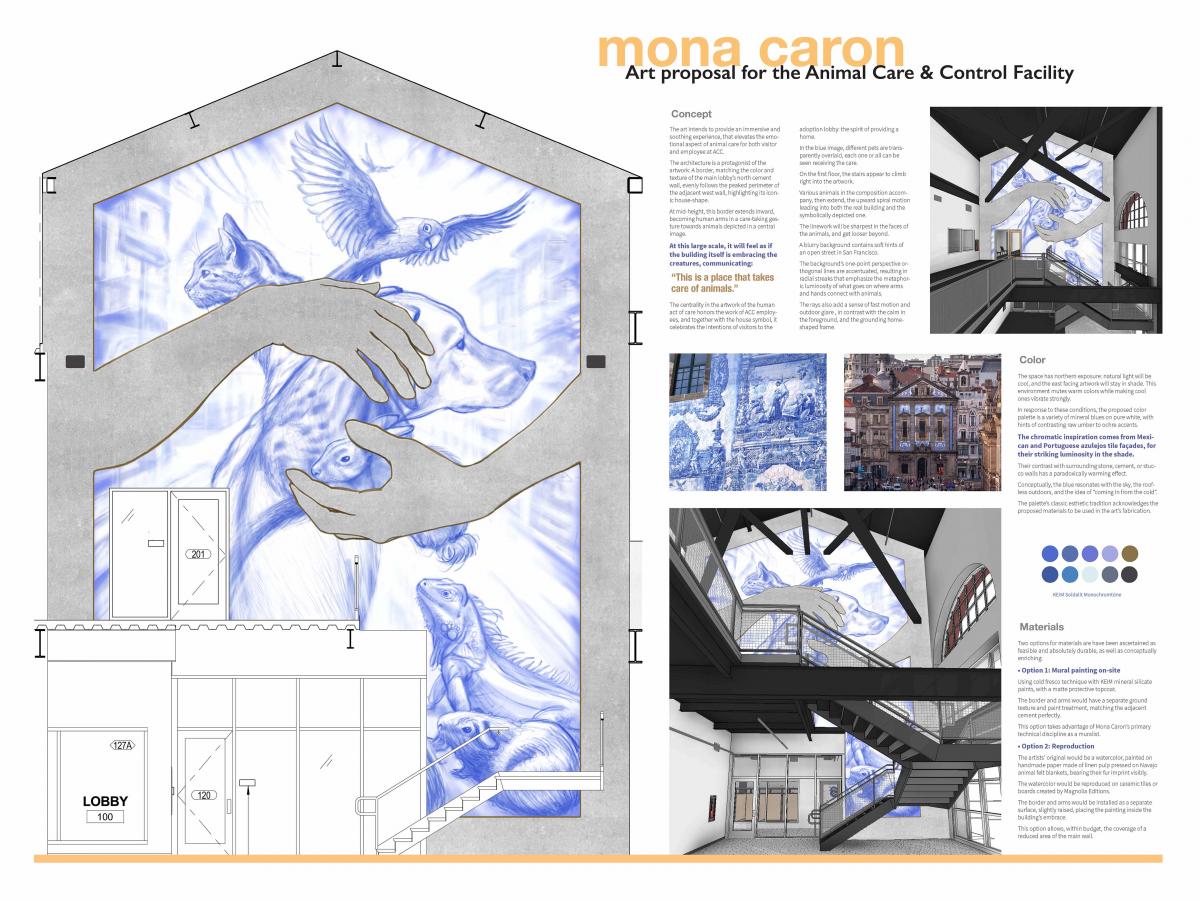
The art intends to provide an immersive and soothing experience, that elevates the emotional aspect of animal care for both visitor and employee at ACC.
The architecture is a protagonist of the artwork: A border, matching the color and texture of the main lobby’s north cement wall, evenly follows the peaked perimeter of the adjacent west wall, highlighting its iconic house-shape.
At mid-height, this border extends inward, becoming human arms in a care-taking gesture towards animals depicted in a central image.
At this large scale, it will feel as if the building itself is embracing the creatures, communicating: “This is a place that takes care of animals.”
The centrality in the artwork of the human act of care honors the work of ACC employees, and together with the house symbol, it celebrates the intentions of visitors to the adoption lobby: the spirit of providing a home.
In the blue image, different pets are transparently overlaid, each one or all can be seen receiving the care.
On the first floor, the stairs appear to climb right into the artwork. Various animals in the composition accompany, then extend, the upward spiral motion leading
into both the real building and the symbolically depicted one.
The linework will be sharpest in the faces of the animals, and get looser beyond. A blurry background contains soft hints of an open street in San Francisco.
The background’s one-point perspective orthogonal lines are accentuated, resulting in radial streaks that emphasize the metaphoric luminosity of what goes on where arms and hands connect with animals.
The rays also add a sense of fast motion and outdoor glare , in contrast with the calm in the
foreground, and the grounding home-shaped frame.
Color
The space has northern exposure: natural light will be cool, and the east facing artwork will stay in shade. This environment mutes warm colors while making cool ones vibrate strongly.
In response to these conditions, the proposed color palette is a variety of mineral blues on pure white, with hints of contrasting raw umber to ochre accents.
The chromatic inspiration comes from Mexican and Portuguese azulejos tile façades, for their striking luminosity in the shade. Their contrast with surrounding stone, cement, or stucco walls has a paradoxically warming effect.
Conceptually, the blue resonates with the sky, the roofless outdoors, and the idea of “coming in from the cold.”
The palette’s classic esthetic tradition acknowledges the proposed materials to be used in the art’s fabrication.
Materials
Two options for materials are have been ascertained as feasible and absolutely durable, as well as conceptually enriching:
Option 1: Mural painting on-site
Using cold fresco technique with KEIM mineral silicate paints, with a matte protective topcoat. The border and arms would have a separate ground texture and paint treatment, matching the adjacent cement perfectly. This option takes advantage of Mona Caron’s primary technical discipline as a muralist.
Option 2: Reproduction
The artists’ original would be a watercolor, painted on handmade paper made of linen pulp pressed on Navajo animal felt blankets, bearing their fur imprint visibly.
The watercolor would be reproduced on ceramic tiles or boards created by Magnolia Editions.
The border and arms would be installed as a separate surface, slightly raised, placing the painting inside the building’s embrace.
This option allows, within budget, the coverage of a reduced area of the main wall.
View larger image of proposal.

 Project Narrative
 Concept
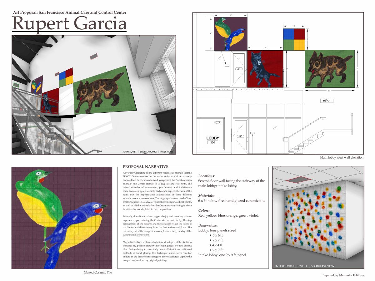 Description of the proposed artwork
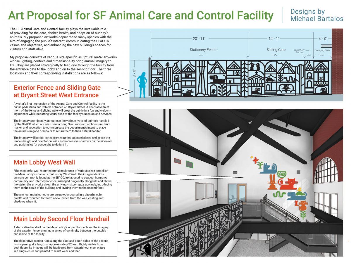
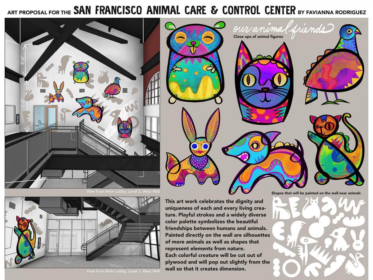 This art piece celebrates the diversity, beauty, and dignity of all living creatures. My aesthetic is playful, colorful, and designed to speak to the imagination of viewers of all ages, including children and youth. The wide range of colors is symbolic for the diverse animal stories of the many species who are housed at the animal care centre. My first goal in creating these animals was to highlight each individual story of every living creature, and in turn to make them more loveable.
Opportunity For Public Comment
Please take a few minutes to review the proposals on display here and complete a comment form below. You may also email your comments to sfacpublicartcomment@sfgov.org, or hand deliver/mail comments to 401 Van Ness Avenue, Room 325 by May 4, 2018 by 5 p.m.
The Final Selection Panel meeting will take place on Wednesday, May 9, 1 p.m. – 5 p.m. at 401 Van Ness Avenue, Room 302. All Artist Selection Panel meetings are open to the public. An agenda for the meeting will be posted 72-hour in advance of the meeting on our calendar.